Friday, April 15, 2016

InfoPath Tip: Adding business days to a date

If you have a date field you want to default to 5 business days from today you can use the following steps to do such a calculation.

Open the form template in InfoPath 2013 Designer. Make sure you already have the date field created.

View the Form Load Rules pane. To display this pane go to the Data ribbon and at the far right you will see a button called "Form Load".

We can set a date field by default when the form loads to a business day in the future using three form load rules.

Rule 1 - Detect Sunday

This rule needs two condition criteria. First we don't want to overwrite an existing value and second is to detect of the date we want, 7 days from today, lands on a Sunday. If that condition is met then we need to set the date field to 5 days from today so the resulting day is the next Friday.

To detect if 7 days from today is a Sunday you will enter this XPath expression in the condition field.
(number(substring(xdDate:AddDays(xdDate:Today(), 7), 9, 2)) + number(number(substring(xdDate:AddDays(xdDate:Today(), 7), 1, 4)) - floor((14 - number(substring(xdDate:AddDays(xdDate:Today(), 7), 6, 2))) div 12)) + floor(number(number(substring(xdDate:AddDays(xdDate:Today(), 5), 1, 4)) - floor((14 - number(substring(xdDate:AddDays(xdDate:Today(), 7), 6, 2))) div 12)) div 4) - floor(number(number(substring(xdDate:AddDays(xdDate:Today(), 7), 1, 4)) - floor((14 - number(substring(xdDate:AddDays(xdDate:Today(), 7), 6, 2))) div 12)) div 100) + floor(number(number(substring(xdDate:AddDays(xdDate:Today(), 7), 1, 4)) - floor((14 - number(substring(xdDate:AddDays(xdDate:Today(), 7), 6, 2))) div 12)) div 400) + floor(31 * number(number(substring(xdDate:AddDays(xdDate:Today(), 7), 6, 2)) + 12 * floor((14 - number(substring(xdDate:AddDays(xdDate:Today(), 7), 6, 2))) div 12) - 2) div 12)) mod 7 = 0
The rule's condition looks like this:
The rule's action looks like this:


Rule 2 - Detect Saturday

This rule is identical to the first rule except that the XPath condition compares the result to 6, representing Saturday, instead of 0 representing Sunday. The action differs by adding 6 days to today so the result is the next Friday.
(number(substring(xdDate:AddDays(xdDate:Today(), 7), 9, 2)) + number(number(substring(xdDate:AddDays(xdDate:Today(), 7), 1, 4)) - floor((14 - number(substring(xdDate:AddDays(xdDate:Today(), 7), 6, 2))) div 12)) + floor(number(number(substring(xdDate:AddDays(xdDate:Today(), 5), 1, 4)) - floor((14 - number(substring(xdDate:AddDays(xdDate:Today(), 7), 6, 2))) div 12)) div 4) - floor(number(number(substring(xdDate:AddDays(xdDate:Today(), 7), 1, 4)) - floor((14 - number(substring(xdDate:AddDays(xdDate:Today(), 7), 6, 2))) div 12)) div 100) + floor(number(number(substring(xdDate:AddDays(xdDate:Today(), 7), 1, 4)) - floor((14 - number(substring(xdDate:AddDays(xdDate:Today(), 7), 6, 2))) div 12)) div 400) + floor(31 * number(number(substring(xdDate:AddDays(xdDate:Today(), 7), 6, 2)) + 12 * floor((14 - number(substring(xdDate:AddDays(xdDate:Today(), 7), 6, 2))) div 12) - 2) div 12)) mod 7 = 6

Rule 3 - Set Due Date one week ahead

The final rule has one condition like the previous two of making sure the date field is empty, meaning the field didn't have a value when it was loaded and the previous rules didn't set it. It doesn't need to check if the new date lands on a week end because both those scenarios have already been addressed with the first two rules.  All this rule needs to do is set the date field to 7 days from today which is the equivalent of adding 5 business days to today. This looks like the following:


InfoPath Tip: Alternative option for promoting check box list or multiple-selection list box

You have a list of choices and users need the ability to select any number of those choices. The problem is how to get the user's selection to appear as one column in a SharePoint library/list. If you promote each check box choice then you would end up with one column for each but maybe that isn't what you want or need.

The steps outlined here demonstrate how to use built-in InfoPath fields, controls and rules to populate one text field listing all the selected options which you can then promote as a single column to the SharePoint library.  Let's get started.

Click here to download the InfoPath 2013 form built following the instructions below.

Step 1 - Create your data fields

Start by opening your existing InfoPath form template or create a new one based on the Blank Form template. Click Blank Form on the File menu's New pane and then click the Design Form button.

The Fields pane should appear by default but if not, click the Data ribbon and then the Show Fields button.

Here are all the fields you need to create:

  1. One True/False field for each available option users can choose, call these "Choice1", "Choice2" and so on
  2. One text field for storing the user's selections, call this the "AllUserSelections" field
  3. One True/False field that will control updating the "AllUserSelections" field when any of the choice fields change, call this the "SelectionsChanged" field 

Click the myFields drop-down menu in the Fields pane and select Add.
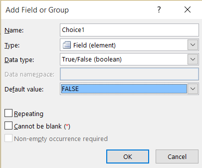
Give the new data field a name, like "Choice1", select True/False for the Data type and leave the default value as False. Here is how the fields for each available option should be configured.
Repeat the above to create a data field for each available option.

Now create the "AllUserSelections" text field.
Create one more True/False data field this time called "SelectionsChanged" the same as each of the available option fields above.

The Fields pane should now look like this depending on how may of the "ChoiceN" fields you created.

Step 2 - Add check box controls for each available option field

Place your cursor on the form's design surface where you want all the check boxes to appear.

From the Fields pane, click the drop-down on the Choice1 field and select the Check Box option at the top of the menu.

With your cursor next to the new check box, type the text you want to appear for that option. I added a title of "My New Years Resolutions" and then for my first choice "Exercise 3x per week". You could get fancier with a more error-proof option by creating a field to store the value of the labels, like Choice1Label as a text data type and then bind those fields to Calculated Value controls on the form next to each check box. I'll leave that up to you to figure out though.
Add a check box in the same way for the remaining available option fields. It should look something like this.

Step 3 - Add rules to each check box control

Now for the real fun. The general idea here is that each time any of the check boxes are checked (or unchecked), the value of the "AllUserSelections" field needs to be updated. What we want to avoid however, is having to duplicate the rules that perform this update. This is where the "SelectionsChanged" field comes in. In Step 4 we will add the rules to the "SelectionsChanged" field but in this step we need to add one rule to each of the check boxes on the form which will update the "SelectionsChanged" field.  Easy enough.  Here is how.

Click the drop-down on the first available choice field, "Choice1" in my case, and click the Rules... option. This will open the Rules pane.

Click the New button in the Rules pane.
Choose "Action" from the available options.

Replace "Rule 1" with "Update Choices", leave the Conditions empty (None) and then for "Run these actions" click the Add button and click on "Set a field's value".
In the Rule Details window, click the Field selector button to the right of the Field text box.
On the Select a Field or Group window click the "SelectionsChanged" field and click OK.

Now enter "true" (all lower case) in the Value field. You could also click the fx button and enter the True() function if you prefer.

Next, copy the "Update Choices" rule you just created and paste it on each of the other check boxes. Use the Copy or Copy All icon buttons or the select Copy from the rule's drop-down menu.
 Paste button appears active when you have the Choice2 field selected.

Step 4 - Add rules to the SelectionsChanged field

Next up is the most complicate part of this whole process. First, let me outline the logic of the next set of rules we need to build.

  1. Stop processing all rules if SelectionsChanged is false. This prevents an infinite loop so executing the remaining rules only occurs once each time the state of one of the check boxes is changed.
  2. Delete the current value in the AllUserSelections. Every time a user clicks any of the check boxes, checking it or unchecking it, we need to repopulate the value of  AllUserSelections from scratch.
  3. Set the SelectionsChanged back to false. This is the second half of the puzzle preventing an infinite loop.
  4. If the first check box is checked then set the value of AllUserSelections to the text you want displayed. In my case I'll set it to "Exercise 3x per week" 
  5. For the 2nd, 3rd check boxes and so we need two rules, the first one appends a comma and that option's text to the existing value of AllUserSelections if it exists while the second rule sets the value of AllUserSelections to the option's text.
In the end you will end up with 4 rules plus 2x the total number of check boxes minus 1 all associated with the SelectionsChanged field. In my case I have 3 check boxes so I'll end up creating 8 rules total.

Before we get started creating rules add a Text Box control to our page that displays the AllUserSelections field. Place the cursor on the form's design surface then click the drop-down on the AllUserSelections field in the Field pane and choose Text Box.

Rule 1

Select the SelectionsChanged field in the Fields pane. If the Rules pane isn't visible, click the drop-down on this field and select Rules.

Create a new Action Rule called "Stop processing rules". Click the "None - Rule runs when field" link in the Condition section of the Rules pane.

Define the rule's condition by checking if the SelectionsChanged field is False.

We don't need this rule to perform any actions except to stop processing the rest of the rules but because an action is required I just set the AllUserSelections field's value to itself. 

Then check the "Don't run remaining rules if the condition of this rule is met." option. This rule should look like this:

Rule 2

Next, create an Action rule called "Reset AllUserSelections" that sets the value of the AllUserSelections field to an empty string "".  It doesn't need any conditions and should look like this when you are done with it.

Rule 3

Create another Action rule called "Set SelectionsChanged to false". It doesn't need any conditions and just sets the SelectionsChanged field to False. 

Rule 4

This next rule another Action rule that sets the AllUserSelections field to the first check boxe's desired text value if it is checked.

Rule 5

The next two rules work together to either append the second choice to the AllUserSelections field or replace it.  First, I'll this one "Choice 2 Appended", is to append so our condition will have two criteria ANDed together like this.

The action for this rule uses the concat() function to set append a comma plus this choice's text to the end of whatever already exists in the "AllUserSelections" field.

Rule 6

This second rule dealing with the 2nd check box, I'll call it "Choice 2 Only", replaces the value of AllUserSelections with the text for this check box rather than appending it with a leading comma. We only do this if the check box is checked and the AllUserSelections field is empty.  This is how the rule looks.

Rule 7 & Beyond

For every check box option after the 2nd one, you will need to repeat creating two rules based on Rule 5 and 6. You can save a little time if you copy Rule 5, modify it for the next check box, copy Rule 6 and modify it for this check box also. The key is to always order the appending rule first followed by the replacing rule. Here are all 8 of my rules.

Testing

Preview your form and try all the various options of selecting the various check boxes and see what appears in the AllUserSelections text box.


Step 5 - Allowing for an "Other" option

To allow users to enter their own "other" option you need to add one more True/False data field that the check box will be bound to and a text field to capture the user's text.  In my example I called the True/False field ChoiceOther and the text field ChoiceOtherText.

Add the ChoiceOther as a check box to the form design surface and enter "Other" next to it. Below that, add a text box bound to the ChoicOtherText field.
Copy the "Update Choices" rule from one of the other check boxes created earlier and paste it on the ChoiceOtherText text box, not the check box.

Add a rule to the ChoiceOther check box that clears the ChoiceOtherText field if the check box is unchecked.
Add a formatting rule to the ChoiceOtherText text box that hides it if the ChoiceOther check box is checked.
Now select the SelectionsChanged field in the field pane. Copy one of the Append and one of the Only rules and modify them but append or replace the AllUserSelections field with the value from the ChoiceOtherText field instead of the hard coded text.

Preview the form and see how it works.

Step 6 - Promoting a single field and publish the form

When you setup publishing using the Publish to SharePoint wizard or you go to the Form Options window's Property Promotion tab, add the AllUserSelections to the fields you want to appear in the form library when published.

Thursday, March 3, 2016

Add Cascading Drop-downs To Any SharePoint List or Library

Here is everything you need to add to five cascading drop-down fields to any SharePoint list or library. This can be accomplished in under 30 minutes.

Turn this...
      
Into this...
     

High-level Steps:

  1. If you don't already have one, create a list that stores all the allowed combinations for the cascading drop-downs (one column for each level of drop-down). I will refer to this list as the Source Options list.
  2. Add 2-5 single line of text columns to the list or library that will hold the values from the cascading drop-down fields. I will refer to this list/library as the Cascading Drop-down list.
  3. Modify and upload the JS Link file (supplied below) to a shared library in the same site collection as the Cascading Drop-down list and Source Options list.
  4. Download the compressed, production JQuery file and upload it to the same shared library as the JS Link file.
  5. Modify the New and Edit form web parts for the Cascading Drop-down list by entering a URL into it's JS Link property.

Assumptions:

  • All the lists and JavaScript files reside in the same site collection

Step 1: The Source Options list

This list can be any SharePoint list or external BCS list in the same site collection as the list that will display these choices as cascading drop-downs.  The column names can be whatever you choose so long as you know (or can figure out) what their internal names are. In the example table below, the levels correspond to Continent, Country, State, and City.  You can download this list template if you don't want to create your own from scratch.  If you only need two cascading drop-downs you can ignore Levels 3 and 4.
Level 1
Level 2
Level 3
Level 4
North America
United States
MD
Germantown
North America        
United States        
MD        
Rockville
North America        
United States        
MD        
Silver Spring
North America        
United States        
VA        
Manassas
North America        
United States        
VA        
Arlington
South America        
Argentina        
Buenos Aires        
Buenos Aires
Central America        
Costa Rica        
San Jose        
San Jose
North America        
Mexico        
Chihuahua        
Chihuahua
North America        
Mexico        
Juarez        
Juarez

Step 2: The Cascading Drop-down list/library

This is the list or library that has 2-4 columns which need to be presented as cascading drop-downs. If your list or library doesn't have these columns already just add them (single line of text). I highly recommend creating them with initial names that do not include spaces or special characters. You can rename them later and add the spaces or special characters back in.

Step 3: The JS Link file

Here is where we get into the meat and potatoes of this solution. Download the CascadingDropDowns.js file (what I'm calling the JS Link file) and modify the variables in the first 34 lines to configure it to match your Source Options list and the Cascading Drop-down list/library. These lines are commented pretty well already but I'll summarize here.
  • restUrl variable: enter the display name of the Source Options list into the URL that is provided inside the GetByTitle parenthesis. Be sure to include the single quotes around it. For example:
    • /_api/web/lists/GetByTitle('My Source Options List')/items
  • LevelNInternalName variables: set these to the internal names of each corresponding Cascading Drop-down list/library column. Levels 3 and 4 can be set to an empty string (two double quotes) if they aren't needed. For example:
    • var Level1InternalName = "Continent";
  • LevelNSource variables: set these to the internal name of the corresponding column in the Source Options list. Levels 3 and 4 can be set to an empty string (two double quotes) if they aren't needed. For example:
    • var Level1Source = "Level1";
  • cascadingFieldContext.Templates.Fields JSON definition: each first level item needs to match the corresponding LevelNInternalName variable. Do not change "NewForm", "EditForm" or any of the renderLevelNField entries.

Once you have modified those lines, upload this file to a shared library in your site collection such as the Site Assets library.

Step 4: The JQuery file

This solution's JS Link file relies on JQuery and in order for JQuery to be loaded properly it needs to be available somewhere in your site collection. If you don't already have this stored somewhere in your site collection I recommend putting it in the same shared library as the JS Link file. You can download JQuery here.  The JS Link file was built using version 2.2.1.

Step 5: Wire up the JS Link file

If the cascading drop-down is to be used in a library then we only need to do the following on the Edit Properties page. For lists however, the following needs to be done on both the New and Edit Properties pages.
  1. Browse to the Edit Properties page
    1. You will need to create an item in the Cascading Drop-down list or upload a document to the  Cascading Drop-down library if one does not already exist.
    2. Check the box next to the item/document and then click Edit Properties from the Items or Files ribbon menu.                                                                          
  2. Browse to the list and click the New Item button at the top to display the New form.
  3. Once on the Edit Properties or New form properties page, click the Settings Gear icon at the top right of the page and click the Edit Page option.
  4. Click the drop-down arrow at the top right of the form web part and click the Edit Web Part option.                                                                                 
  5. Collapse the Appearance web part properties section and expand the Miscellaneous section
  6. Enter the following into the JS Link property assuming you put the JQuery and JS Link files
    1. ~sitecollection/SiteAssets/jquery-2.2.1.min.js|~sitecollection/SiteAssets/CascadingDropDowns.js
  7. Click the Ok button on the Web Part Properties panel.
  8. Click the Stop Editing button on the Page ribbon menu.

Conclusion

That's it! Now anyone entering a new item, uploading a new document into your list/library or editing the item or document's properties will have the cascading drop-down functionality. Don't forget to enter all the allowed options in your Source Options list.